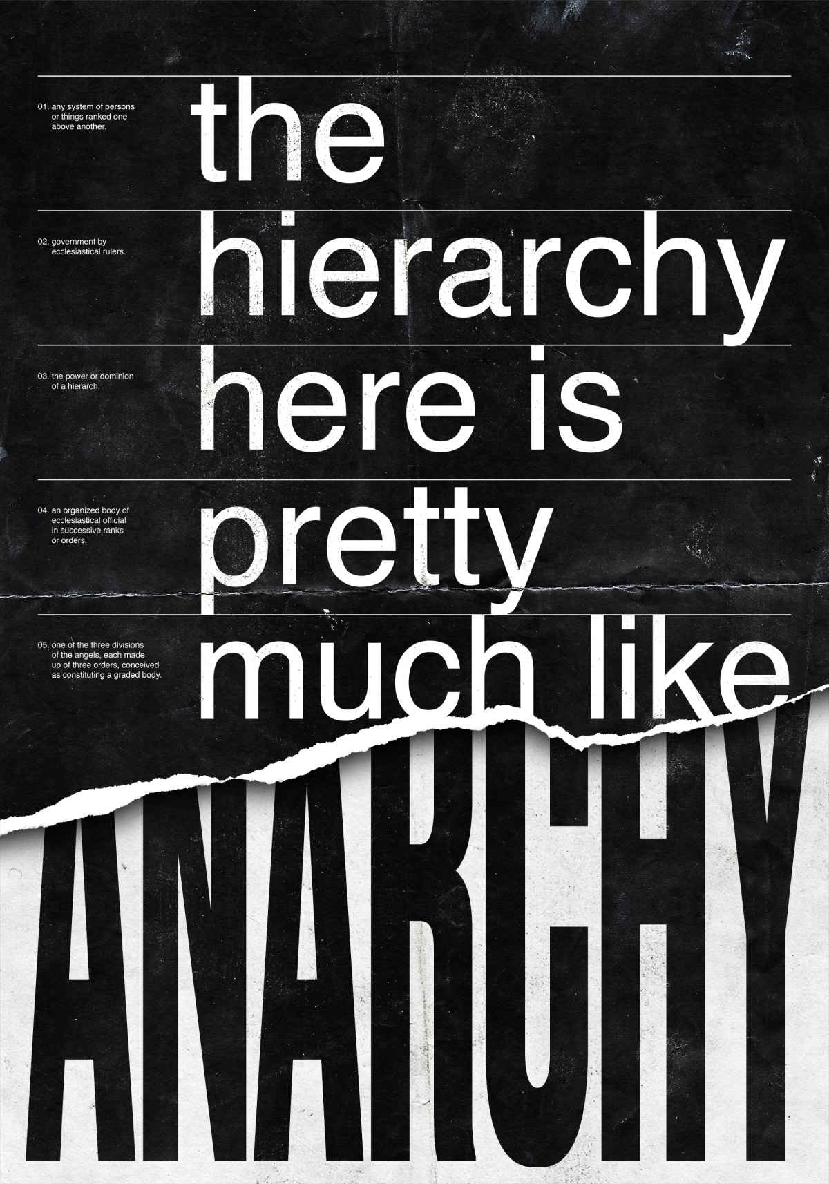
“The hierarchy here is pretty much like anarchy.”
What’s the idea behind your poster?
It was not easy to finish the sentence! In the first place, I was not sure if the sentence should refer to the hierarchy in the studio, or in the poster itself. Anyway, every time I looked around me searching for inspiration, the only thing I saw was the crazy posters that Dumbar has been doing for Amsterdam Sinfonietta during the last years. These posters are known for their crazy, complex, busy designs, so in the end, I came up with this idea of “visual anarchy.” Also as a copy for me, it sounded interesting, since “anarchy” means literally “absence of hierarchy,” so it was pretty much like a paradox.


