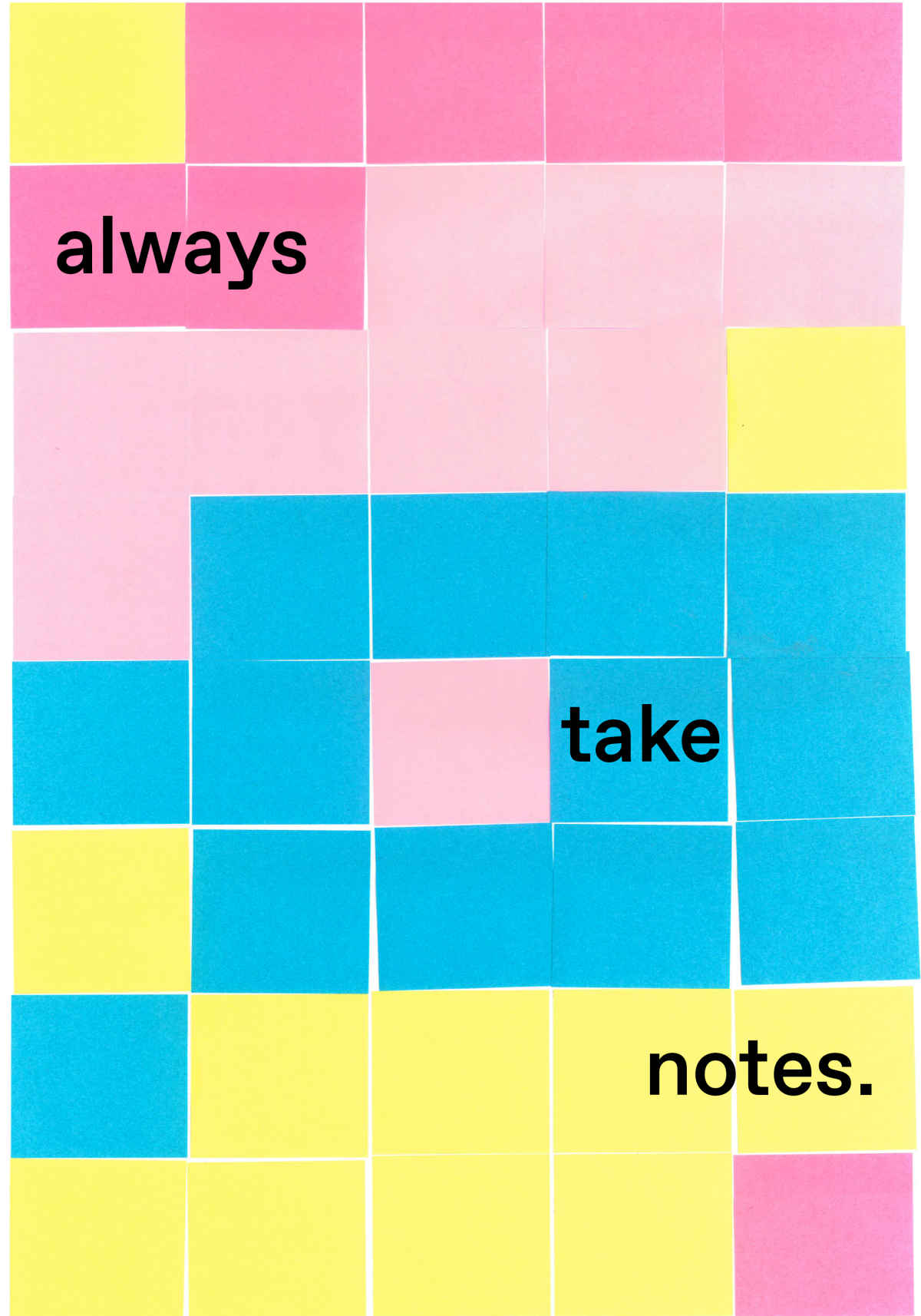
“The most important thing I’ve learned is to always take notes.”
What’s the idea behind your poster?
During my internship, I have learned so many things; therefore, I decided to focus on something apparently not very important—rather than on significant principles about graphic design. In fact, I liked the idea of creating something ironic and fresh, that makes you smile. This is why I completed the given sentence with “always take notes”: sometimes I am a bit forgetful and my tutors always moke on me about this, reminding me to note down everything.
Then, as I wanted to convey the message by mixing an analog approach with the digital one, I started to experiment by scanning and photocopying my own notes taken during the last weeks. In the end, I decided to simplify everything: I made a composition using some post-its on a piece of paper and scanned it, to use it as the background of the poster. In this way, the “fourth wall” is broken, and the image is perceived as both surface and representation.


